
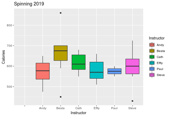
Having graphed my stats for 2018 (see posts here and here) it was only right that I do the same for 2019, so here they are.
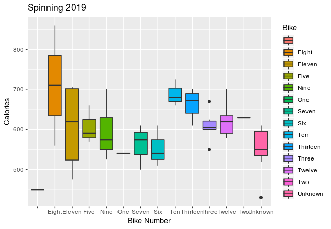 Having run a few more 10Ks this year, I’ve included that data in my charts:
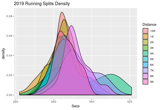
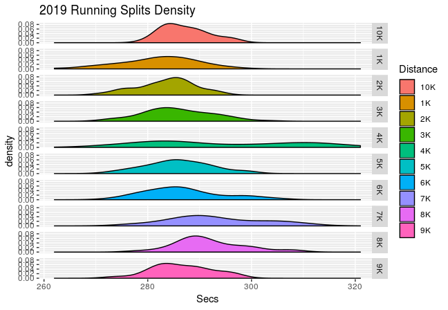 I think the next two charts are informative, showing how my running time changes over the year:
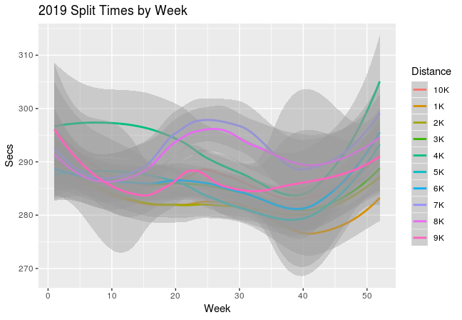
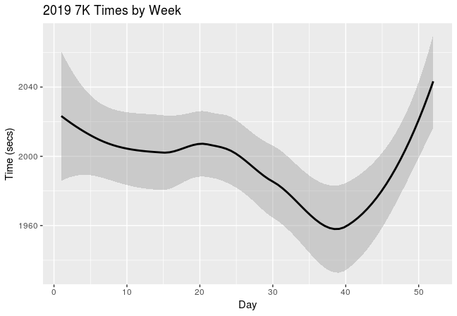 (This year I’ve plotted my data by week rather than by day (for ease of data collection))
And my weight:
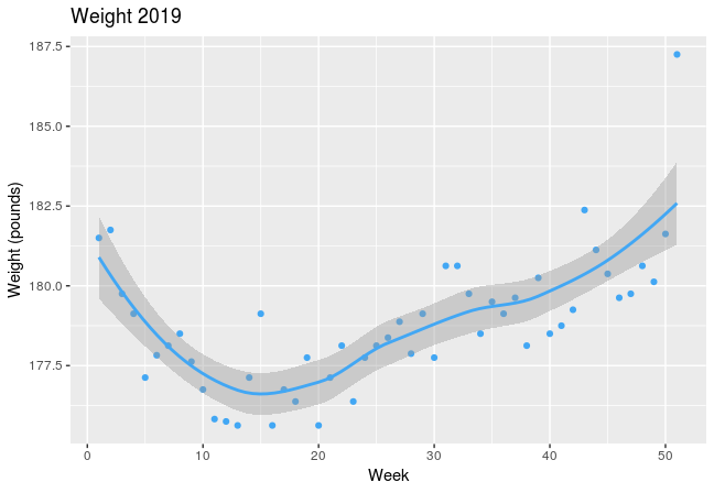 although interestingly my lowest weight doesn’t correlate directly with my quickest running times. Although, the 7K v Weight plot does, once again, show correlation between the two:
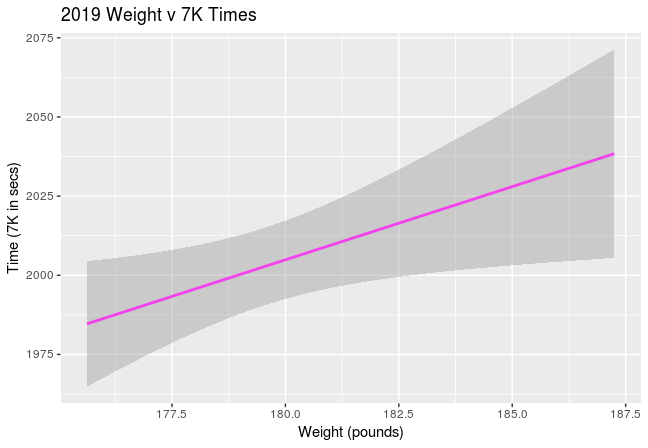
First job the new year – get that weight back down!